Implementing Dark Mode In Ionic 5

Software Developer | Technical Writer | Actively helping users with their questions on Stack Overflow.
Ionic 5 is the latest version of Ionic released. In this guide, we will use that version to implement dark mode in the application.
Get Started With Ionic 5
Updating Ionic 4 Projects
So, if you already have an ionic application, to upgrade it you need to execute the following command in the terminal:
npm i @ionic/angular@latest --save --save-exactThe above is specifically for Ionic applications that are using Angular. Since starting with version Ionic 4, other frameworks like Vue and React were added also. Then you can start using Ionic 5 features in the project.
Creating Ionic 5 Project
To start a new Ionic 5 project, you need to execute the following command:
ionic start project_name blankwhich will take the latest ionic version by default.
Then you can execute ionic info, to check if you are using Ionic 5:
Ionic CLI : 6.1.0 (/usr/local/lib/node_modules/@ionic/cli)
Ionic Framework : @ionic/angular 5.0.0
@angular-devkit/build-angular : 0.803.25
@angular-devkit/schematics : 8.3.25
@angular/cli : 8.3.25
@ionic/angular-toolkit : 2.1.2
Utility:
cordova-res : not installed
native-run : 0.3.0
System:
NodeJS : v10.15.0 (/usr/local/bin/node)
npm : 6.4.1
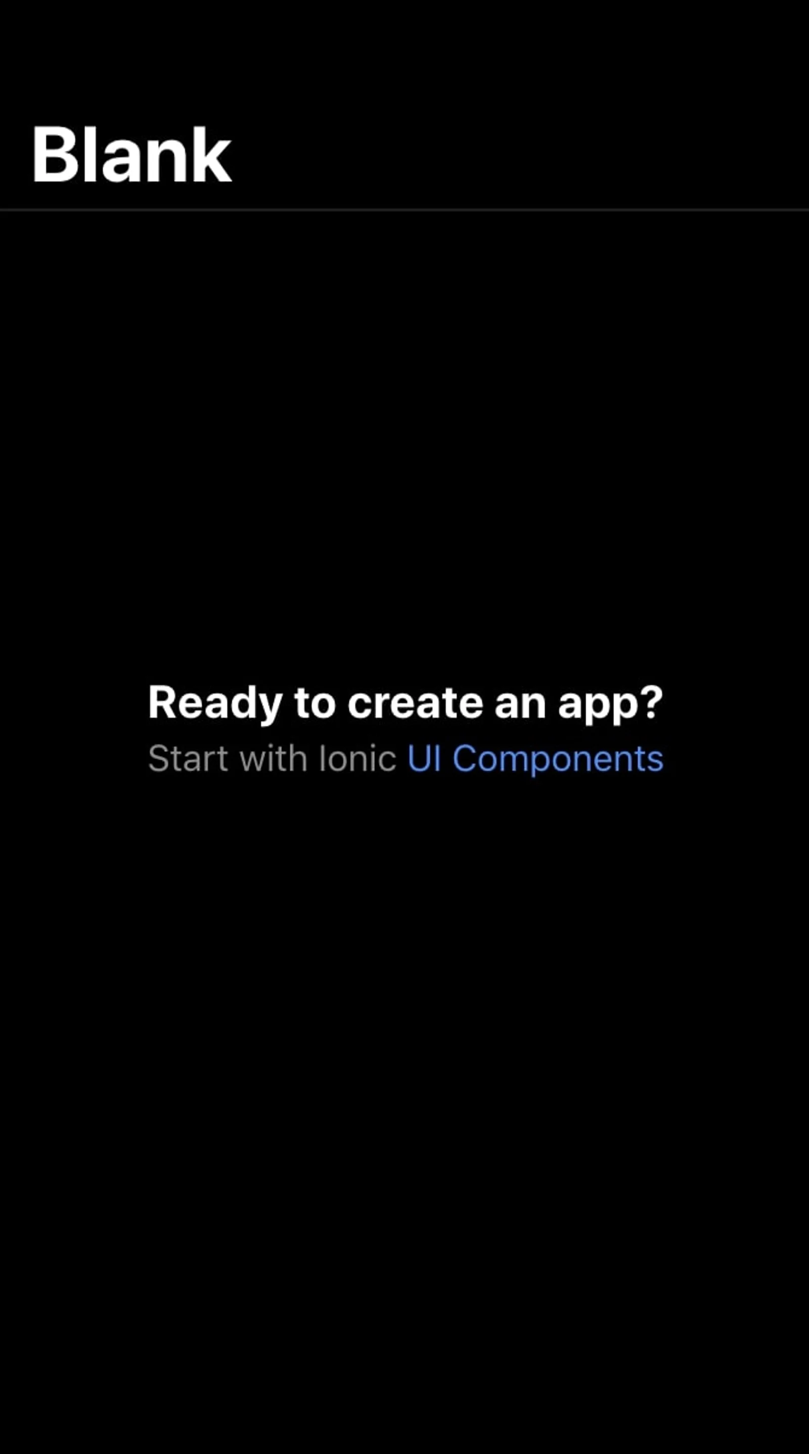
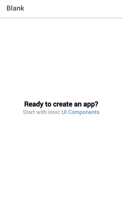
OS : macOS MojaveAs you can see in the output above, we are using version 5.0.0 in this project. Now if you execute the command ionic serve, which will launch a development server in the browser. You will see the following page:
Implementing Dark Mode
Now if you navigate to the variables.css file, you will see new ionic colors added to be able to implement dark mode easily in the application. For example:
@media (prefers-color-scheme: dark) {
  /*
   * Dark Colors
   * -------------------------------------------
   */

  body {
    --ion-color-primary: #428cff;
    --ion-color-primary-rgb: 66,140,255;
    --ion-color-primary-contrast: #ffffff;
    --ion-color-primary-contrast-rgb: 255,255,255;
    --ion-color-primary-shade: #3a7be0;
    --ion-color-primary-tint: #5598ff;

    --ion-color-secondary: #50c8ff;
    --ion-color-secondary-rgb: 80,200,255;
    --ion-color-secondary-contrast: #ffffff;
    --ion-color-secondary-contrast-rgb: 255,255,255;
    --ion-color-secondary-shade: #46b0e0;
    --ion-color-secondary-tint: #62ceff;

    --ion-color-tertiary: #6a64ff;
    --ion-color-tertiary-rgb: 106,100,255;
    --ion-color-tertiary-contrast: #ffffff;
    --ion-color-tertiary-contrast-rgb: 255,255,255;
    --ion-color-tertiary-shade: #5d58e0;
    --ion-color-tertiary-tint: #7974ff;

    --ion-color-success: #2fdf75;
    --ion-color-success-rgb: 47,223,117;
    --ion-color-success-contrast: #000000;
    --ion-color-success-contrast-rgb: 0,0,0;
    --ion-color-success-shade: #29c467;
    --ion-color-success-tint: #44e283;

    --ion-color-warning: #ffd534;
    --ion-color-warning-rgb: 255,213,52;
    --ion-color-warning-contrast: #000000;
    --ion-color-warning-contrast-rgb: 0,0,0;
    --ion-color-warning-shade: #e0bb2e;
    --ion-color-warning-tint: #ffd948;

    --ion-color-danger: #ff4961;
    --ion-color-danger-rgb: 255,73,97;
    --ion-color-danger-contrast: #ffffff;
    --ion-color-danger-contrast-rgb: 255,255,255;
    --ion-color-danger-shade: #e04055;
    --ion-color-danger-tint: #ff5b71;

    --ion-color-dark: #f4f5f8;
    --ion-color-dark-rgb: 244,245,248;
    --ion-color-dark-contrast: #000000;
    --ion-color-dark-contrast-rgb: 0,0,0;
    --ion-color-dark-shade: #d7d8da;
    --ion-color-dark-tint: #f5f6f9;

    --ion-color-medium: #989aa2;
    --ion-color-medium-rgb: 152,154,162;
    --ion-color-medium-contrast: #000000;
    --ion-color-medium-contrast-rgb: 0,0,0;
    --ion-color-medium-shade: #86888f;
    --ion-color-medium-tint: #a2a4ab;

    --ion-color-light: #222428;
    --ion-color-light-rgb: 34,36,40;
    --ion-color-light-contrast: #ffffff;
    --ion-color-light-contrast-rgb: 255,255,255;
    --ion-color-light-shade: #1e2023;
    --ion-color-light-tint: #383a3e;
  }
The @media is used to apply a different style to the application based on the result of its queries. So here in this case, the prefers-color-scheme media feature is used to determine if the user is using dark or light color theme. So if the user, requests the dark color theme, then the above style will be applied.
If you want to apply only dark theme to your application, then you can change the variable.css to the following:
/** Ionic CSS Variables **/
:root {
--ion-color-primary: #428cff;
--ion-color-primary-rgb: 66,140,255;
--ion-color-primary-contrast: #ffffff;
--ion-color-primary-contrast-rgb: 255,255,255;
--ion-color-primary-shade: #3a7be0;
--ion-color-primary-tint: #5598ff;
--ion-color-secondary: #50c8ff;
--ion-color-secondary-rgb: 80,200,255;
--ion-color-secondary-contrast: #ffffff;
--ion-color-secondary-contrast-rgb: 255,255,255;
--ion-color-secondary-shade: #46b0e0;
--ion-color-secondary-tint: #62ceff;
--ion-color-tertiary: #6a64ff;
--ion-color-tertiary-rgb: 106,100,255;
--ion-color-tertiary-contrast: #ffffff;
--ion-color-tertiary-contrast-rgb: 255,255,255;
--ion-color-tertiary-shade: #5d58e0;
--ion-color-tertiary-tint: #7974ff;
--ion-color-success: #2fdf75;
--ion-color-success-rgb: 47,223,117;
--ion-color-success-contrast: #000000;
--ion-color-success-contrast-rgb: 0,0,0;
--ion-color-success-shade: #29c467;
--ion-color-success-tint: #44e283;
--ion-color-warning: #ffd534;
--ion-color-warning-rgb: 255,213,52;
--ion-color-warning-contrast: #000000;
--ion-color-warning-contrast-rgb: 0,0,0;
--ion-color-warning-shade: #e0bb2e;
--ion-color-warning-tint: #ffd948;
--ion-color-danger: #ff4961;
--ion-color-danger-rgb: 255,73,97;
--ion-color-danger-contrast: #ffffff;
--ion-color-danger-contrast-rgb: 255,255,255;
--ion-color-danger-shade: #e04055;
--ion-color-danger-tint: #ff5b71;
--ion-color-dark: #f4f5f8;
--ion-color-dark-rgb: 244,245,248;
--ion-color-dark-contrast: #000000;
--ion-color-dark-contrast-rgb: 0,0,0;
--ion-color-dark-shade: #d7d8da;
--ion-color-dark-tint: #f5f6f9;
--ion-color-medium: #989aa2;
--ion-color-medium-rgb: 152,154,162;
--ion-color-medium-contrast: #000000;
--ion-color-medium-contrast-rgb: 0,0,0;
--ion-color-medium-shade: #86888f;
--ion-color-medium-tint: #a2a4ab;
--ion-color-light: #222428;
--ion-color-light-rgb: 34,36,40;
--ion-color-light-contrast: #ffffff;
--ion-color-light-contrast-rgb: 255,255,255;
--ion-color-light-shade: #1e2023;
--ion-color-light-tint: #383a3e;
}
/*
* iOS Dark Theme
* -------------------------------------------
*/
.ios body {
--ion-background-color: #000000;
--ion-background-color-rgb: 0,0,0;
--ion-text-color: #ffffff;
--ion-text-color-rgb: 255,255,255;
--ion-color-step-50: #0d0d0d;
--ion-color-step-100: #1a1a1a;
--ion-color-step-150: #262626;
--ion-color-step-200: #333333;
--ion-color-step-250: #404040;
--ion-color-step-300: #4d4d4d;
--ion-color-step-350: #595959;
--ion-color-step-400: #666666;
--ion-color-step-450: #737373;
--ion-color-step-500: #808080;
--ion-color-step-550: #8c8c8c;
--ion-color-step-600: #999999;
--ion-color-step-650: #a6a6a6;
--ion-color-step-700: #b3b3b3;
--ion-color-step-750: #bfbfbf;
--ion-color-step-800: #cccccc;
--ion-color-step-850: #d9d9d9;
--ion-color-step-900: #e6e6e6;
--ion-color-step-950: #f2f2f2;
--ion-toolbar-background: #0d0d0d;
--ion-item-background: #1c1c1c;
--ion-item-background-activated: #313131;
}
/*
* Material Design Dark Theme
* -------------------------------------------
*/
.md body {
--ion-background-color: #121212;
--ion-background-color-rgb: 18,18,18;
--ion-text-color: #ffffff;
--ion-text-color-rgb: 255,255,255;
--ion-border-color: #222222;
--ion-color-step-50: #1e1e1e;
--ion-color-step-100: #2a2a2a;
--ion-color-step-150: #363636;
--ion-color-step-200: #414141;
--ion-color-step-250: #4d4d4d;
--ion-color-step-300: #595959;
--ion-color-step-350: #656565;
--ion-color-step-400: #717171;
--ion-color-step-450: #7d7d7d;
--ion-color-step-500: #898989;
--ion-color-step-550: #949494;
--ion-color-step-600: #a0a0a0;
--ion-color-step-650: #acacac;
--ion-color-step-700: #b8b8b8;
--ion-color-step-750: #c4c4c4;
--ion-color-step-800: #d0d0d0;
--ion-color-step-850: #dbdbdb;
--ion-color-step-900: #e7e7e7;
--ion-color-step-950: #f3f3f3;
--ion-item-background: #1A1B1E;
}
ion-title.title-large {
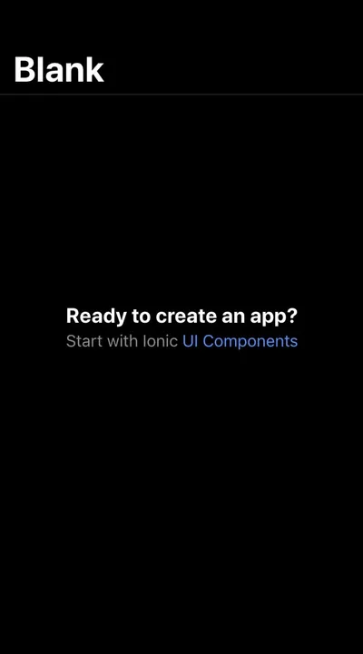
--color: white;
}So, here I removed the media query prefers-color-scheme that checks if dark mode is requested by the user and by default now the application will use dark mode. You will get the following:
Also when executing ionic serve and checking the application in the browser, if you choose any android device, open developer tools, and inspect the element app-root, you will notice that it is taking the Material Design Dark Theme declared in variable.scss.
The :root matches the root element of a tree representing the document, example the html tag.
Dynamically Changing Theme
If you want to be able to change the theme in every page depending on a switch value, then first add an ion-toggle component to the home.page.html:
  <ion-item lines="none">
    <ion-toggle (ionChange)="onClick($event)" slot="end"></ion-toggle>
  </ion-item>
So here, I add the ion-toggle inside the ion-item to be able to use the property slot, so it can appear at the top right of the page, and I use the attribute lines="none to remove the ion-item lines. Also I use the event emitter ionChange which is emitted when the value property has changed, and I use the $event to be able to retrieve the value when switching the toggle. Then inside the home.page.ts file I do the following:
  onClick(event){
    let systemDark = window.matchMedia("(prefers-color-scheme: dark)");
    systemDark.addListener(this.colorTest);
    if(event.detail.checked){
      document.body.setAttribute('data-theme', 'dark');
    }
    else{
      document.body.setAttribute('data-theme', 'light');
    }
  }

   colorTest(systemInitiatedDark) {
    if (systemInitiatedDark.matches) {
      document.body.setAttribute('data-theme', 'dark');
    } else {
      document.body.setAttribute('data-theme', 'light');
    }
  }
I add the onClick(event) method, and use the matchMedia, which returns a MediaQueryList object. After that I can use the property matches to check if my document currently matches the media query. Then I use the addListener() that will run a custom callback function in response to the media query status changing. Then if the toggle is checked, I set the attribute dark-theme equal to dark and use it on the body element, else I set the attribute to dark-theme equal to light. This way the theme can be changed. Now in the variable.scss, I add the attribute dark-theme to the body:
  body[data-theme="dark"]{
    ....
  }
  .ios body[data-theme="dark"] {
    ...
  }
  .md body[data-theme="dark"]{
    ...
  }
  @media (prefers-color-scheme: dark) {
  body[data-theme="dark"]{
    ....
   }
  .ios body[data-theme="dark"] {
    ...
   }
  .md body[data-theme="dark"]{
    ...
   }
  }
