Using Animations In Flutter

Software Developer | Technical Writer | Actively helping users with their questions on Stack Overflow.
In this article, we will learn about the implicit and explicit animations that are used in Flutter applications and give examples about them.
Animations in Flutter
In some mobile applications you would have to add animations to make the user experience smoother. Flutter makes it so easy to add animations to the applications by offering built-in widgets that will facilitate the process of adding animations. So since there are different types of animations in Flutter, in the documentation you can find the below graph which you can use to decide which animation type you need:
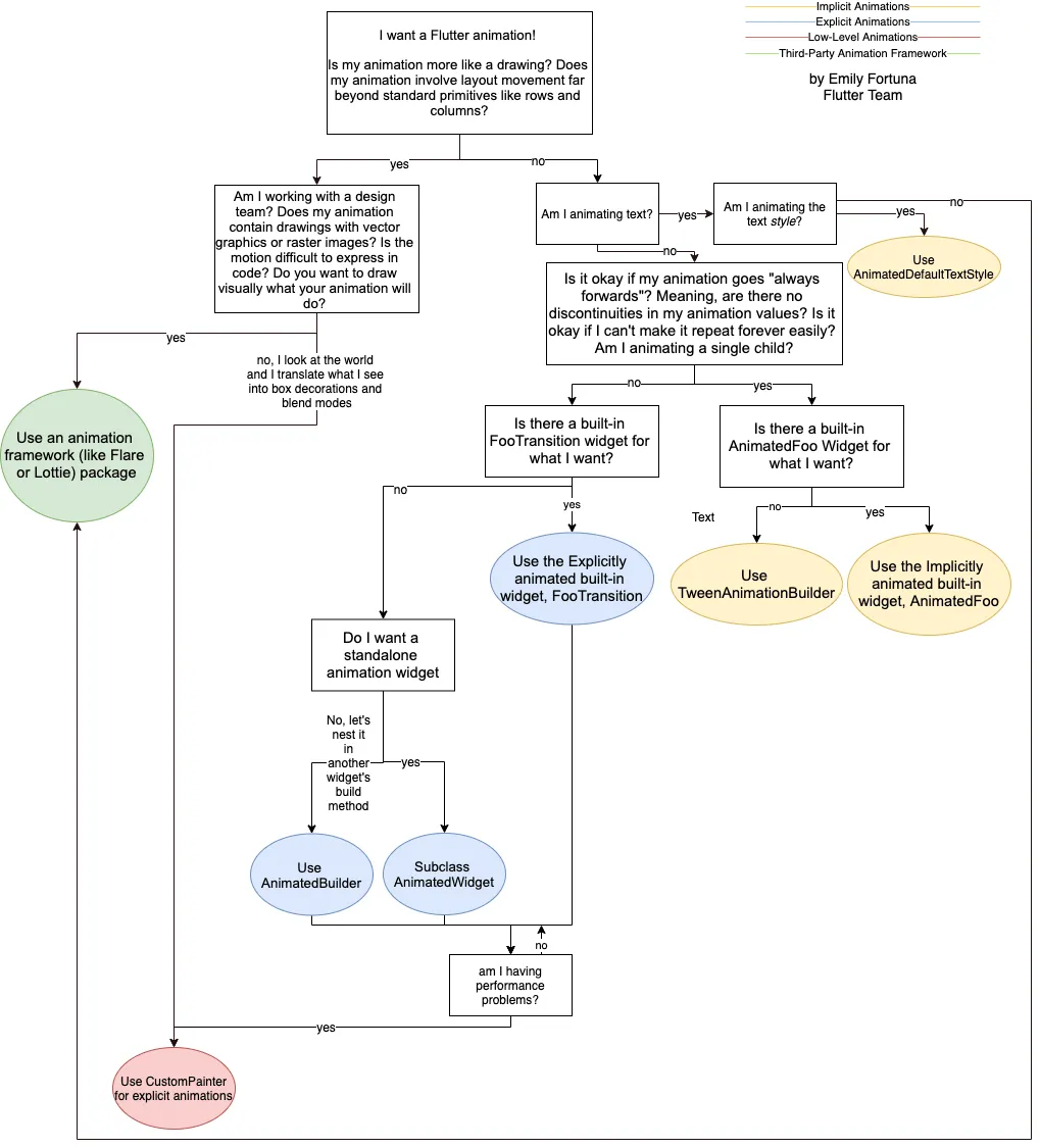
The two major animation types included are the implicit animation and the explicit animation.
The implicit animations are animations that are managed by the Flutter SDK and are used for simple animations. They are usually named AnimatedFoo where Foo is the type of widget used.
The explicit animations are low-level animations, in which you have more control over the animation and are used for animations that require repitition.
Implicit Animations
The implicit animations are all widgets that extend the class ImplicitlyAnimatedWidget, you can find the most common ones below:
- AnimatedContainer
- AnimatedDefaultTextStyle
- AnimatedPositioned
- AnimatedOpacity
For example the AnimatedContainer is the implicit animation of a Container, while the AnimatedPositioned is the implicit animation of the Positioned widget that’s used inside a Stack.
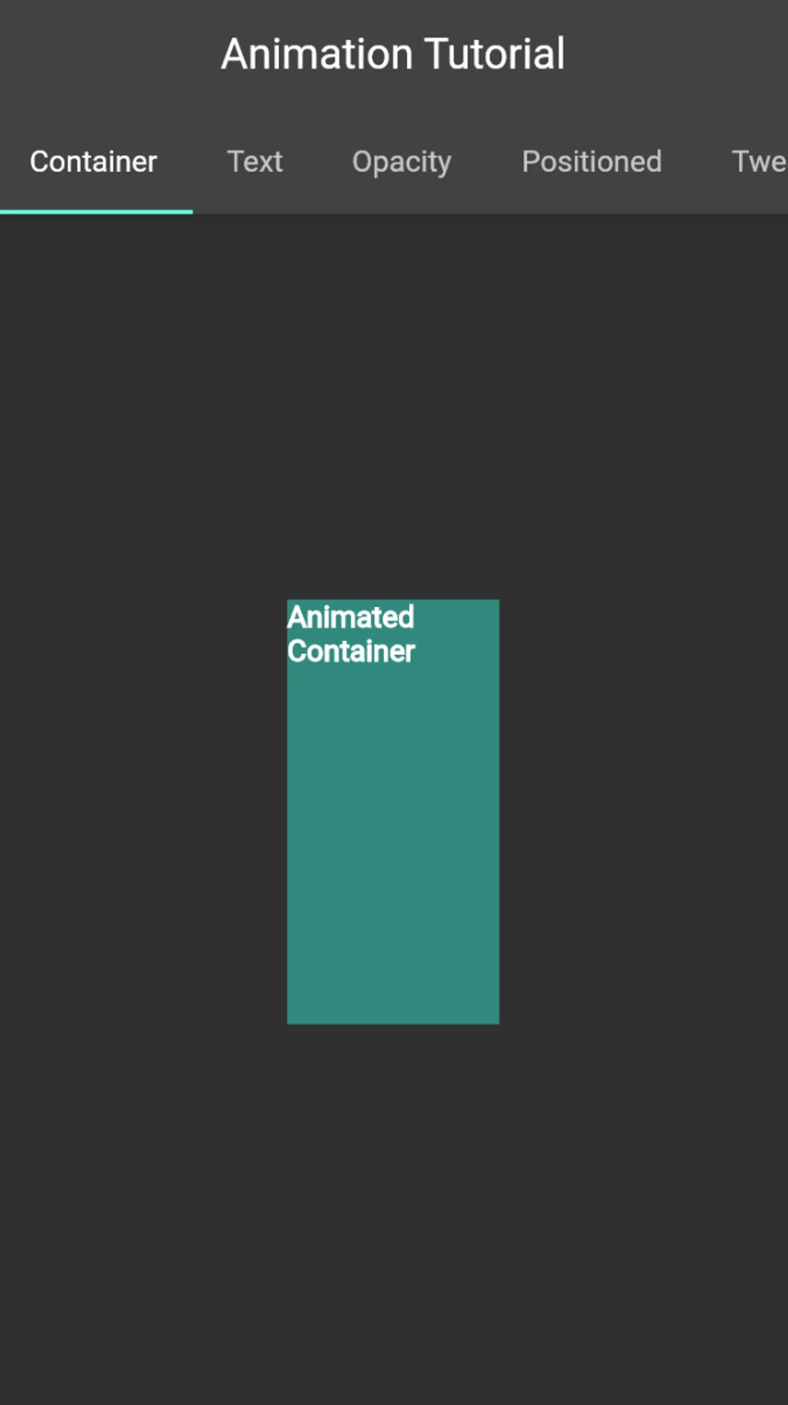
AnimatedContainer
To use the AnimatedContainer first create a StatefulWidget so we can use setState():
class AnimationContainer extends StatefulWidget {
  const AnimationContainer({Key? key}) : super(key: key);

  @override
  _AnimationContainerState createState() => _AnimationContainerState();
}
Then inside the _AnimationContainerState you can use the AnimatedContainer widget:
class _AnimationContainerState extends State<AnimationContainer> {
  bool selected = false;
  Color value = Color((math.Random().nextDouble() * 0xFFFFFF).toInt()).withOpacity(1.0);

  @override
  Widget build(BuildContext context) {
    return GestureDetector(
      onTap: () {
        setState(() {
          selected = !selected;
        });
      },
      child: Center(
        child: AnimatedContainer(
          width: selected ? 200.0 : 100.0,
          height: selected ? 100.0 : 200.0,
          color: value,
          alignment:
              selected ? Alignment.center : AlignmentDirectional.topCenter,
          duration: const Duration(seconds: 1),
          curve: Curves.fastLinearToSlowEaseIn,
          child: const Text("Animated Container",style: TextStyle(fontWeight: FontWeight.bold),),
        ),
      ),
    );
  }
}
As you can see in the code above, we use the widget GestureDetector which will detects gestures. Then we use the AnimatedContainer which contains the same properties as a normal Container except here we have the duration property and the curve property.
The duration property is used to determine how much time this animation will take, while the curve property will take a value of type Curve. Fortunately, in Flutter there is a class called Curves that offers different type of animations. You can see all the animations here. So in the above code, whenever we click on the AnimatedContainer, then the width, height and alignment properties will all change their values thus creating an animation. You can find the full video of all the animations at the end of the article.
AnimatedDefaultTextStyle
Also the AnimatedDefaultTextStyle is considered an implicit animation, but the difference compared to AnimatedContainer is that it is used to animate a Text:
  @override
  Widget build(BuildContext context) {
    return GestureDetector(
      onTap: () {
        setState(() {
          selected = !selected;
        });
      },
      child: Center(
        child: AnimatedContainer(
          width: selected ? 200.0 : 100.0,
          height: selected ? 100.0 : 200.0,
          color: Color((math.Random().nextDouble() * 0xFFFFFF).toInt()).withOpacity(1.0),
          alignment:
              selected ? Alignment.center : AlignmentDirectional.topCenter,
          duration: const Duration(seconds: 1),
          curve: Curves.fastLinearToSlowEaseIn,
          child:  AnimatedDefaultTextStyle(duration: Duration(seconds: 1), style: TextStyle(color: Color((math.Random().nextDouble() * 0xFFFFFF).toInt()).withOpacity(1.0)), curve: Curves.elasticInOut,
          child: Text("Animated Text",style: TextStyle(fontWeight: FontWeight.bold),),),
        ),
      ),
    );
  }
As you can see in the above code, we use both the AnimatedContainer and the AnimatedDefaultTextStyle giving both a duration of one second. Here the AnimatedDefaultTextStyle will change the color of the Text everytime we tap on the AnimatedContainer.
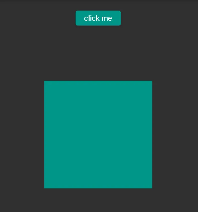
AnimatedPositioned
Another implicit animation is called AnimatedPositioned, in this case we need to use the Stack widget, for example:
  Widget build(BuildContext context) {
    return Stack(
      alignment:  Alignment.topCenter,
      children: <Widget>[
        AnimatedPositioned(
            width: 200,
            height: 200,
            top: selected ? 50.0 : 150.0,
            duration: const Duration(seconds: 2),
            curve: Curves.bounceIn,
            child: Container(
              color: Colors.teal,
            )),
        Positioned(
          top: 20,
            child: ElevatedButton(
              style: ButtonStyle(backgroundColor: MaterialStateProperty.all(Colors.teal)),
                onPressed: () {
                  setState(() {
                    selected = !selected;
                  });
                },
                child: const Text("click me"),))
      ],
    );
  }
Here inside the Stack widget we have both the Positioned widget and the AnimatedPositioned widget. When we press the ElevatedButton, the value of selected changes, thus the Container will go up and down creating an animation.
Custom Implicit Animation
If you need something different than the above animations, then you can create your own custom implicit animation. To be able to create this kind of animation, you need to use the TweenAnimationBuilder. This widget builder animates a property of a widget to a target value whenever the target value changes. The TweenAnimationBuilder has a property called tween that accepts a value of type Tween. A Tween will have a start point and an end point, and it also excepts a variety of objects, for example:
  Widget build(BuildContext context) {
    return Center(
      child: TweenAnimationBuilder(
          curve: Curves.linearToEaseOut,
          tween: ColorTween(begin: Colors.green, end: targetColor),
          duration: Duration(seconds: 2),
          builder: (BuildContext context, Color? value, Widget? child) {
            return GestureDetector(
              child: Container(color: value),
              onTap: (() {
                setState(() {
                  if (value == Colors.green) {
                    targetColor = Colors.amber;
                  } else {
                    targetColor = Colors.green;
                  }
                });
              }),
            );
          }),
    );
  }
Here we use the ColorTween, specifying the starting point as green color and the end point will change according to the value of targetColor. The TweenAnimationBuilder will also have a builder of type ValueWidgetBuilder which is a typedef having the following implementation:
typedef ValueWidgetBuilder<T> = Widget Function(BuildContext context, T value, Widget? child);So, the function will have a property of type T where T would be the object used in the Tween which is in this case Color.
Explicit Animation
If you want to have more control on the animation then you need to use explicit animations. These widgets will extend the class AnimatedWidget. They are usually named FooTransition, where Foo is the name of the non-animated version of that widget. Some common widgets:
To use these kind of animations, first you need use a class called AnimationController. This class will control the animation, example if we should play the animation in forward or reverse or even stop the animation. The AnimationController will need a TickerProvider to function correctly, and the TickerProvider will provide a Ticker object. The Ticker will call its callback once per animation frame.
Therefore whenever the callback is called, it informs the AnimationController and we get the next animation frame. Below you can find a simple example:
class _ExplicitAnimationState extends State<ExplicitAnimation>
    with TickerProviderStateMixin {
      late final AnimationController _controller;
      late final Animation<double> _animation;

  @override
  void initState() {
    super.initState();
    _controller  = AnimationController(
      duration: const Duration(seconds: 2),
      vsync: this,
    );
    _controller.repeat(reverse: true);
    _animation = CurvedAnimation(
      parent: _controller,
      curve: Curves.easeInOutQuad,
    );
  }

  @override
  void dispose() {
    _controller.dispose();
    super.dispose();
  }

  @override
  Widget build(BuildContext context) {
    return Container(
      child: FadeTransition(
        opacity: _animation,
        child: Padding(
            padding: const EdgeInsets.all(8),
            child: Image.network("assets/images/mario.png")),
      ),
    );
  }
}
Here, we create an AnimationController in the initState() and destroy it in the dispose(). The vsync property is of type TickerProvider but since we are using the provider as mixin then we can just use this as a value to the vsync property. The repeat() method will start the animation and it will keep repeating the animation. We also create a CurvedAnimation providing it with a specific curve and the AnimationController.
Animations
References
I hope you enjoyed reading this flutter tutorial, please feel free to leave any comments or feedback on this post!