Theming your App In Ionic 4

Software Developer | Technical Writer | Actively helping users with their questions on Stack Overflow.

Ionic 4 is mostly used as a UI framework, it can be easily customized and changed according to the requirements.
Shadow DOM
Ionic 4 uses Shadow DOM which is a web component standard. It allows you to seperate internal components of a customized element, and it also makes it easier for the ionic team to maintain the framework since you cannot style the elements that are inside the shadow DOM, except by using CSS custom properties. Further information about that will be provided later in the article.
An Example of shadow Dom:
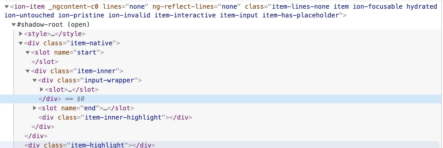
The above screenshot is represents an <ion-item> with attribute lines = "none".
- shadow root is the root node of a shadow tree.
- shadow host is an element that hosts one shadow tree.
You might also see the following:
:host(.item-interactive) {
    --inner-border-width: 0;
}
The .host() is a selector that selects the shadow host of the shadow DOM containing the CSS it is used inside, you can find more about that in the following link: :host()
SCSS Files
In ionic 4 every page will contain its own scss file, you can create different css classes or use id selector to style your page. These scss files will only change the style of a particular page. Also the scss file of every page is declared inside the Component decorator, example:
@Component({
  selector: 'app-home',
  templateUrl: 'home.page.html',
  styleUrls: ['home.page.scss'],
})
Another scss file is the global.scss file, it is used to change the style globally in the project, thus preventing writing the same code more than once. Example, you can use a class selector in the global.scss file:
.input-size
{
    width: 311px !important;
}
Then in the home.page.html, you can apply that style to a component:
<ion-input class="input-size" type="password" placeholder="Name"><ion-input>The last scss file is the variables.scss which is under the theme folder. It contains different custom colors to change the style of your application, more on that in the next section.
Colors
Ionic 4 offers 9 different colors which are all declared inside the variables.scss file. The following image illustrates the different colors:
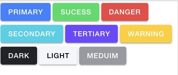
The html:
<ion-button color="primary">Primary</ion-button>
<ion-button color="success">Sucess</ion-button>
<ion-button color="danger">Danger</ion-button>
<ion-button color="secondary">Secondary</ion-button>
<ion-button color="tertiary">Tertiary</ion-button>
<ion-button color="warning">Warning</ion-button>
<ion-button color="dark">Dark</ion-button>
<ion-button color="light">Light</ion-button>
<ion-button color="medium">Meduim</ion-button>variables.scss:
/** Ionic CSS Variables **/
:root {
  /** primary **/
  --ion-color-primary: #3880ff;
  --ion-color-primary-rgb: 56, 128, 255;
  --ion-color-primary-contrast: #ffffff;
  --ion-color-primary-contrast-rgb: 255, 255, 255;
  --ion-color-primary-shade: #3171e0;
  --ion-color-primary-tint: #4c8dff;
}
As you can see above, the :root css selector means that we are targeting the root element of a document. The primary color contains the hex color #3880ff and it also has different related properties which you can change. The ionic team also offers the Color Generator so you can easily customize these colors.
Adding your own Custom Colors
Sometimes, you need to use different color according to the project requirements. To add your own colors, then navigate to the variables.scss file, and add the following class:
.ion-color-companyColors {
  --ion-color-base: #2c3e50;
  --ion-color-base-rgb: 244, 244, 244;
  --ion-color-contrast: #ffffff;
  --ion-color-contrast-rgb: 0, 0, 0;
  --ion-color-shade: #d7d8da;
  --ion-color-tint: #f5f6f9;
}
Inside the :root selector, add the following:
  /** companyColor **/
  --ion-color-companyColor: #2c3e50;
  --ion-color-companyColor-rgb: 244, 244, 244;
  --ion-color-companyColor-contrast: #ffffff;
  --ion-color-companyColor-contrast-rgb: 0, 0, 0;
  --ion-color-companyColor-shade: #d7d8da;
  --ion-color-companyColor-tint: #f5f6f9;
Then inside a template of a page, you can do the following:
<ion-button color="companyColors">Company Colors</ion-button>CSS Custom Properties
As explained in the first section, you can use css custom properties(css variables) to style the ionic component.
Note: CSS variables must begin with two dashes (—) and are case sensitive. They can also be accessed using the var() function.
Example:
:root
{
  --bg-color: red;
}
div
{
  background-color: var(--bg-color);
}
In this case we use var() to access the css variable and assign it to attribute background-color.
In ionic 4, each component has it’s own css custom properties. Example, if you want to change the background color of an ion-alert, you can do the following:
ion-alert
{
    --background        : #2c3e50 !important;
    --ion-text-color    : white !important;
    --ion-color-step-550: white !important;
}
Note: You can override the default ionic variables in the following scss file src/theme/variables.scss.
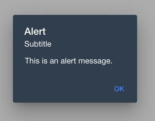
The css variable --background will change the background color of the alert. After changing the background color, you probably want to also change the text color in the alert. Since, there is no custom css property that changes the text color for ion-alert. Then you need to open the dev tools and inspect the text.
After inspecting you will get the following:
.alert-title.sc-ion-alert-md
{
    color: var(--ion-text-color,#000);
}
Both the alert title and subtitle will have the color black, to be able to change the color, you need to take the css variable which is --ion-text-color and add it in your scss file so you can override the color. You would then get the following alert:
Ionic Icon
Ionic also offers some icons that can be used in web, IOS, android and desktop apps. To check the list of icons, go to the following page ionicons.
Ionicons contains a different version for IOS and android.
Example of using ionicons:
<ion-icon name="add"></ion-icon>You can also specify a style for the icons, example you can use name="ios-add", thus it will use the IOS version.
I hope you enjoyed reading this ionic tutorial, please feel free to leave any comments or feedback on this post!